
VetWeb insight
Does Your Veterinary Practice Look Like One Business?
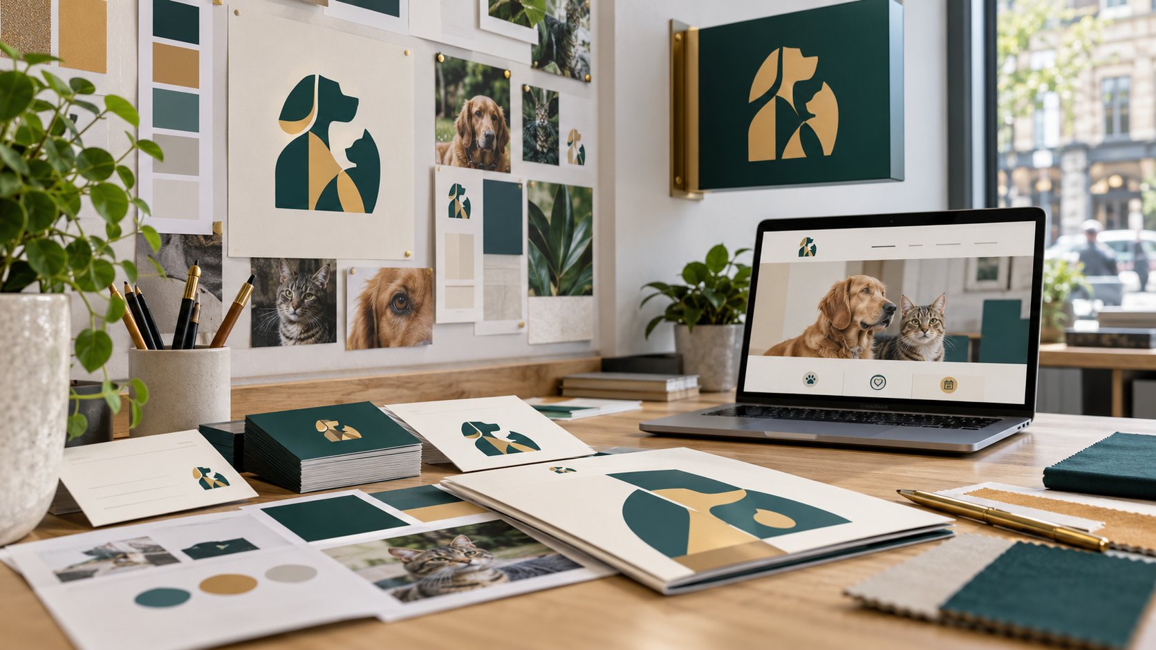
A client might discover your practice on Google, visit the website, notice a window graphic and pick up a leaflet at reception. Those encounters can happen weeks apart. They should still feel like they belong to the same practice.
Brand consistency helps people recognise that connection. It also gives the team a clearer way to explain what the practice offers. You can make useful improvements without starting with a full rebrand.
Start with the message people should remember
Ask three people in the practice to complete this sentence: “We are a good choice for clients who value…” Compare their answers. If each person describes a different business, the first job is agreeing the message.
Use something the practice can demonstrate. Continuity with a small team, a particular appointment approach or facilities for a defined group of animals may be relevant. A broad claim about caring more is harder for a client to understand or verify. The strongest starting point is a specific promise the team can deliver.
Put the main touchpoints next to each other
Collect a mobile screenshot of the homepage, a photograph of the entrance, the latest campaign poster, a client leaflet and an email. Look at them together rather than reviewing each item in isolation.
- Does the practice name appear consistently?
- Are different versions of the logo competing with one another?
- Do the colours and typography make the materials recognisable?
- Does the wording describe the same practice and services?
- Is the next step clear and appropriate to that particular item?
Consistency does not require every piece to look identical. A road sign and a detailed guide have different jobs. They need a shared visual language, with enough flexibility to make each format useful.
Look for mismatches that create uncertainty
A poster may use an old name for a service while the website uses a new one. A leaflet may carry a telephone number that sends clients to the wrong branch. An email can promise an online booking option that the linked page does not offer.
These are useful problems to fix first because they affect the client’s next action. Make a short list with the item, the mismatch, the person responsible and the replacement needed. Prioritise inaccurate information and difficult routes before minor decorative differences.
Create a small, usable brand kit
The team needs a practical reference they can use when ordering a sign or making a social graphic. A compact kit can include approved logo files, colour references, type choices, a few writing examples and templates for regular materials.
Keep a single approved folder and name the final files clearly. Include separate versions for dark and light backgrounds, plus a square profile icon that remains readable at a small size. Explain when to use each one. This reduces the temptation to copy an old logo from a screenshot.
Choose three changes and check them in the real world
For example, a practice could align its homepage introduction, entrance signage and welcome leaflet around the same message. That is a manageable first phase. It also connects the route from initial interest to arrival.
Review the results on a phone, from the pavement and at the reception desk. Ask a colleague who was not involved to explain what the materials say and what they would do next. Their uncertainty is useful feedback.
Give consistency an owner
Brand drift often returns when different suppliers and team members create materials independently. Assign someone to maintain the approved kit and check new work against it. Review the most visible touchpoints when a service, branch or booking process changes.
VetWeb’s branding and signage service connects the message with the visual system. If you want to see how those details work together, explore the practice journey or talk to us about your brand.